June 22, 2026
Designing an Ed-Tech Platform for Teachers and Students
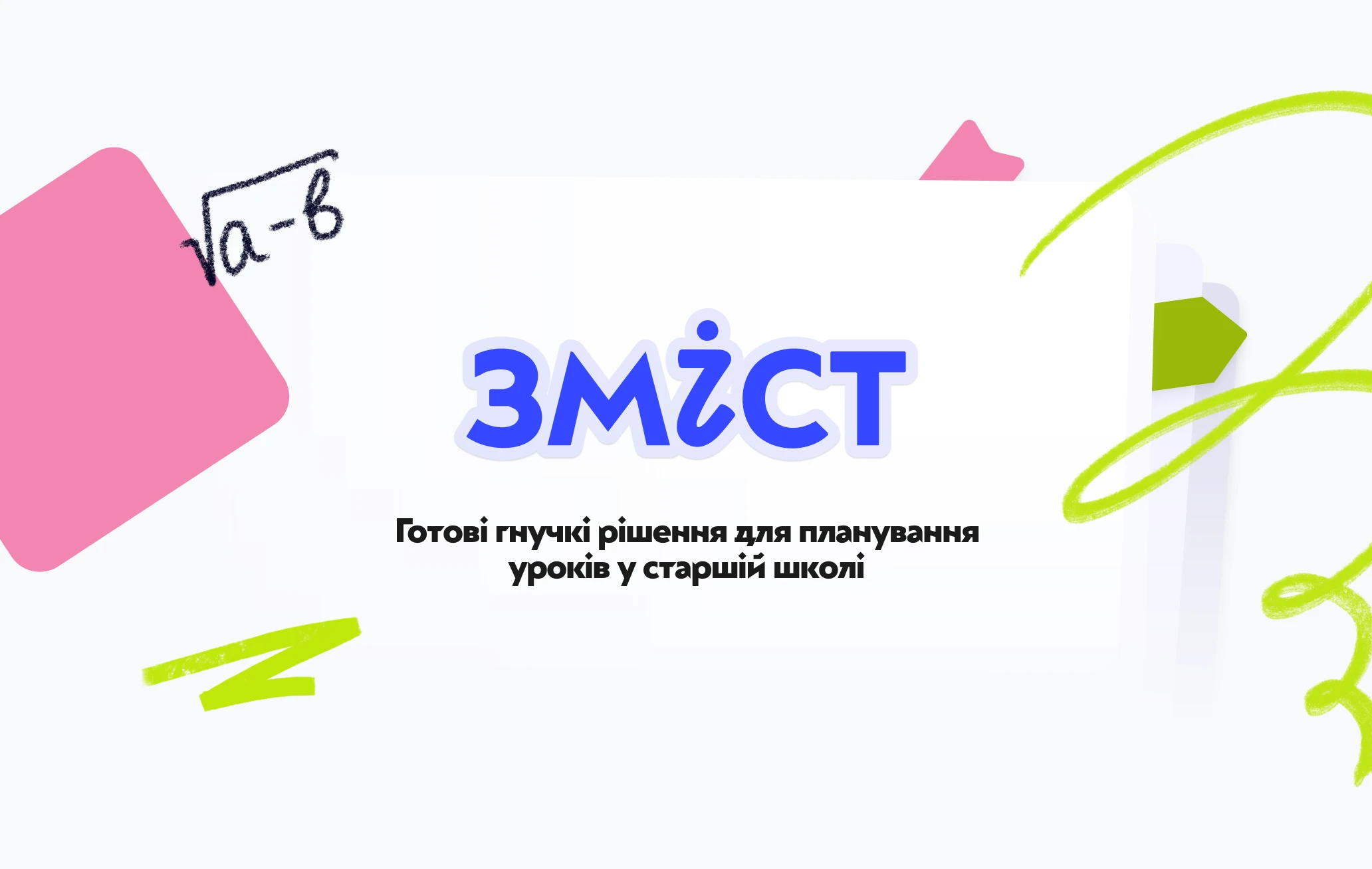
Zmist is an online platform with ready, flexible teaching materials for high school.
Zmist is an online platform with ready, flexible teaching materials for high school.
Its goal is to make teachers' work easier and give students quality subject content. It covers several educational fields and holds lessons, presentations and extra materials — with two separate interfaces, one for the teacher and one for the student.
We designed it from scratch. That meant building not just a visual shell, but a full navigation system and the user logic underneath it.
The platform holds a lot of material, and two different people use it for different things. The brief came down to four points: keep the interface clear and easy without overloading anyone, structure a large volume of content so it reads intuitively, hold logical links between fields, courses and lessons, and make it feel modern and warm — in the spirit of Ukrainian educational culture.
We dropped decoration in favour of air, cleanliness and logic. (The branding itself was done by the Zmist team; we built the product design on top of it.) We paired the Ukrainian typeface Almaz with the neutral grotesque Inter, and drew our own set of simple hand-drawn illustrations that add friendliness without clutter. A system of colour accents marks the course levels — core, specialised and free-choice — so the structure is readable at a glance.
We built the structure so the user always knows where they are and can get back easily. From any section you can jump straight to lessons, materials or presentations. The logic works like a route map: you see your path and don't get lost, even in a large volume of content.
We spent around 100 hours working through every user flow — from first login to downloading materials — and tested each step against real usage scenarios to keep the navigation transparent.
Zmist got a coherent product design and a clear system of user scenarios. It reads as academic and modern at once: it builds trust and stays out of the way of the one thing that matters — the knowledge. The platform is in test mode now, getting ready to become a public hub for schools across Ukraine.
We design product UX and UI for platforms with a lot of content and more than one type of user — clear navigation, sensible structure and an interface people actually enjoy using. If that's your product, let's talk.
📧 hello@hotburo.com · hotburo.com