About project
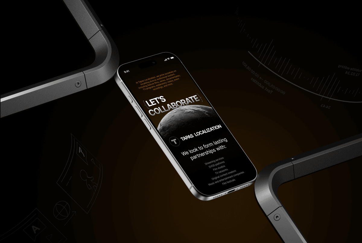
Tapas Localization is a boutique multilingual media localization agency working across 30+ languages, including rare dialects.
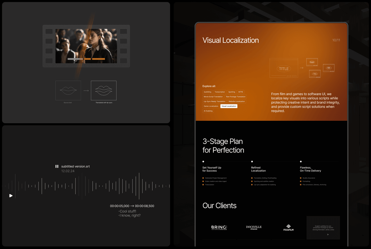
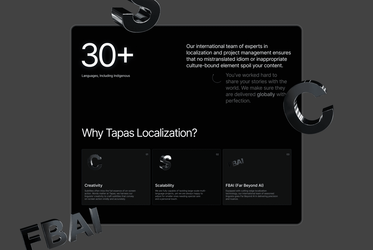
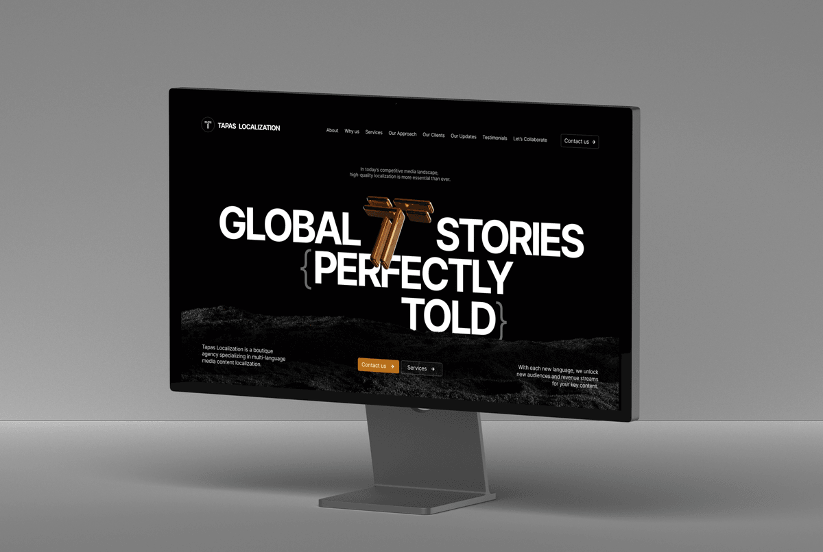
We designed a new website built on a strong metaphorical system: sand symbolizing flexibility and adaptation, and metallic 3D forms representing precision and structured processes.An interactive rotating “T” element enhances the first screen, while typography and curly brackets { } became a key visual device reflecting localization logic and adaptability.
Result
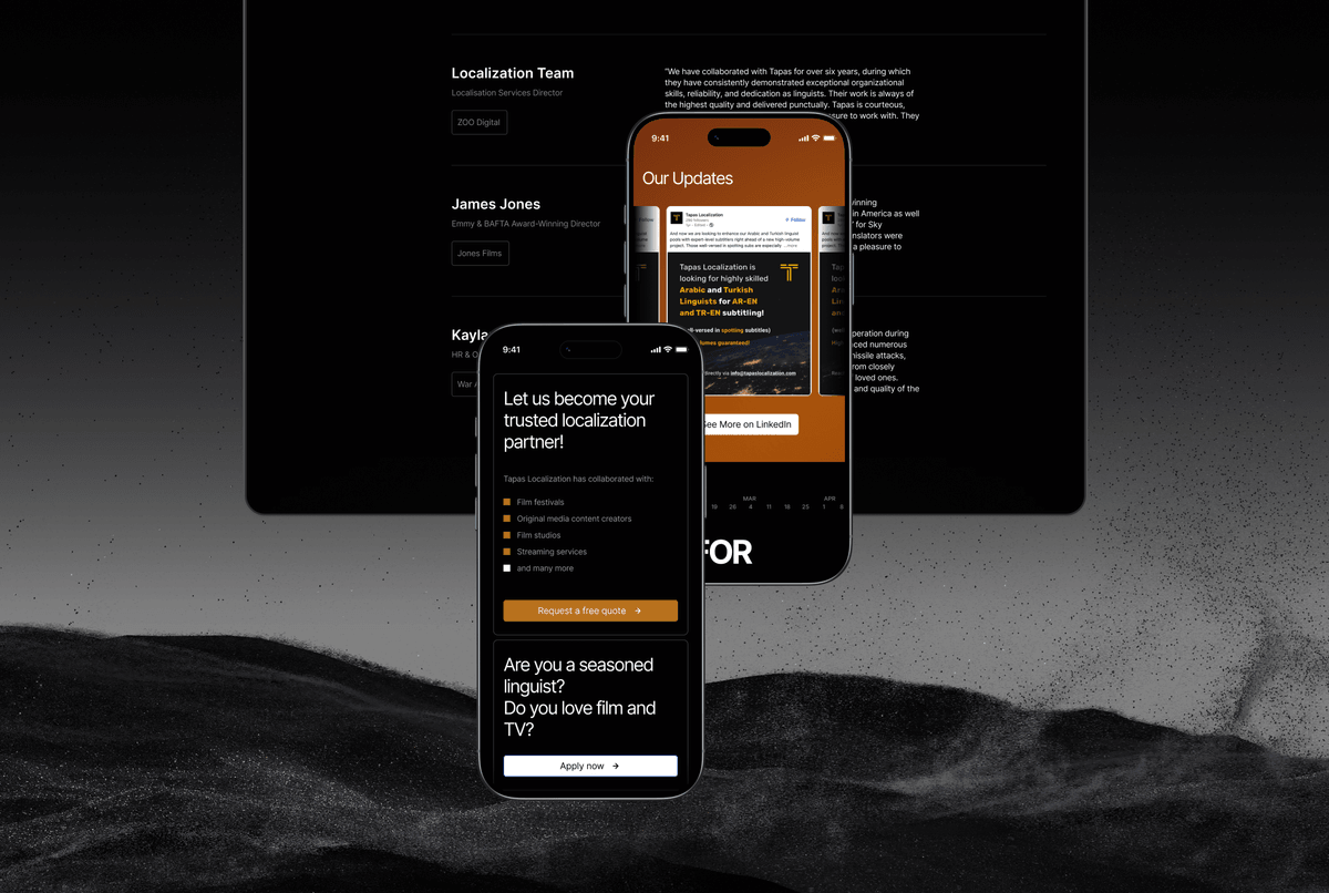
The new platform strengthens the brand’s positioning, differentiates it visually, and presents the company as modern, precise, and technologically advanced across digital touchpoints.