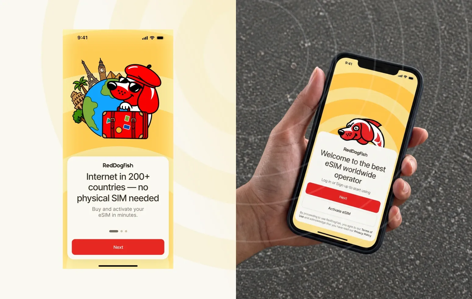
eSIM Travel App Redesign: The RedDogFish Case Study
How we refreshed the mascot, simplified the eSIM setup flows and brought RedDogFish’s app and landing page together into one consistent product — without a rebrand.
ReadHow we build brands, websites and products — from the first idea to launch. No fluff, just decisions you can take into your own project.
How we refreshed the mascot, simplified the eSIM setup flows and brought RedDogFish’s app and landing page together into one consistent product — without a rebrand.
Read
How we built a brand from scratch — with a wave inside a circle as a symbol of market movement — and carried it into a platform full of complex trading data.
Read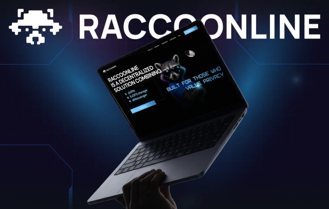
How we turned a realistic raccoon into a pixel mark that works in any colour, and carried the new style through the landing page, VPN app and messenger.
Read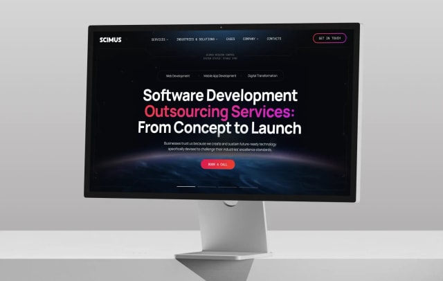
How we brought services, industries, case studies, careers and a blog into one corporate website — with a contrasting black-and-white system and modular blocks.
Read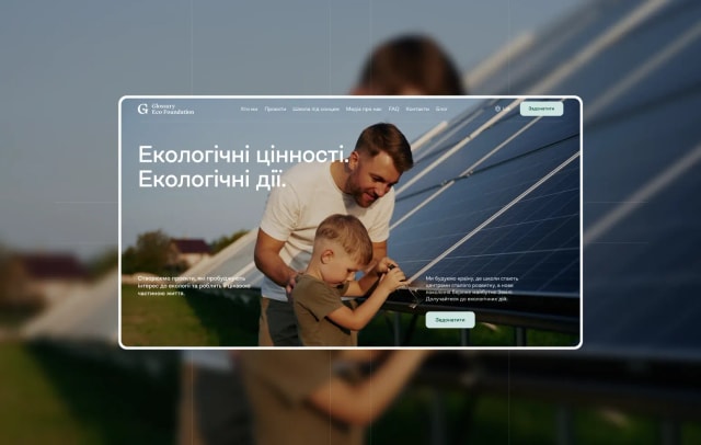
How we brought the foundation’s existing branding into digital, found in testing that the site was too complex, and made it simpler without losing its character.
Read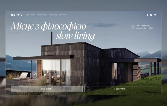
How we built a visual system from scratch and a website where guests book a stay and investors explore the resort — without the two journeys getting mixed up.
Read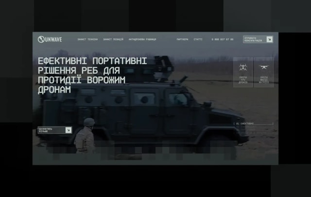
How we brought a defence-tech brand into digital, drew graphics in the style of technical diagrams, designed a scalable filtered catalogue — and built the site on WordPress.
Read
Weeks of searching for the right shape led nowhere — then one founder’s story about the Golden Bridge in Vietnam gave the brand its mark and meaning. Here’s how we got to the DSDNX logo.
Read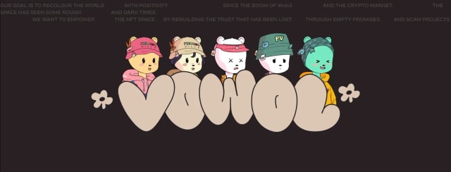
How we renamed an NFT project, built its identity around a little flower and prepared the brand for an entire digital universe.
Read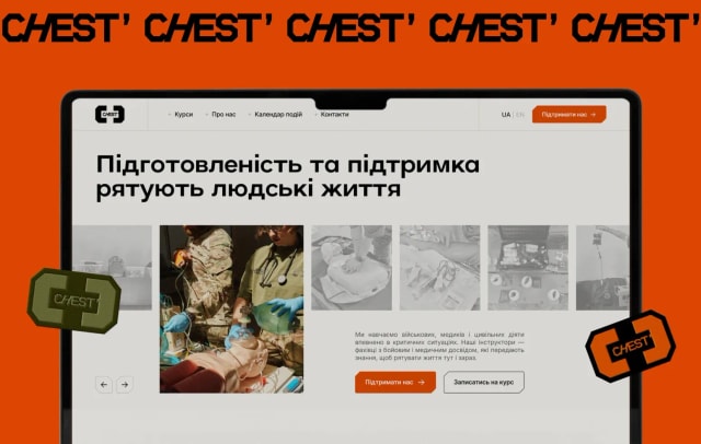
How we developed the organisation’s brand for digital and brought its work, training courses, news and donations together on one website.
Read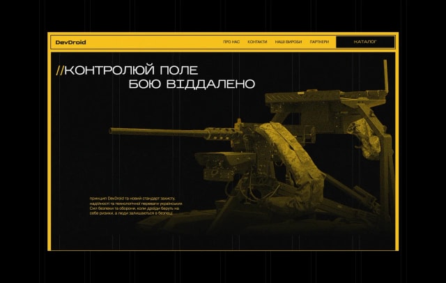
How we turned a brand into a digital system with engineering-interface aesthetics and brought products, catalogue, Droid Box, training and news into one website.
Read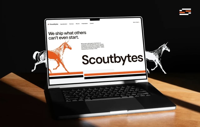
How a single square module became the foundation for a logo, a pattern made of binary code, an interactive website — and even a unicorn.
Read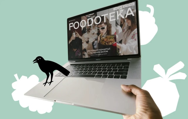
How we reworked the structure of an outdated site, added the sections it was missing and extended Spiilka’s identity with graphic vegetables.
Read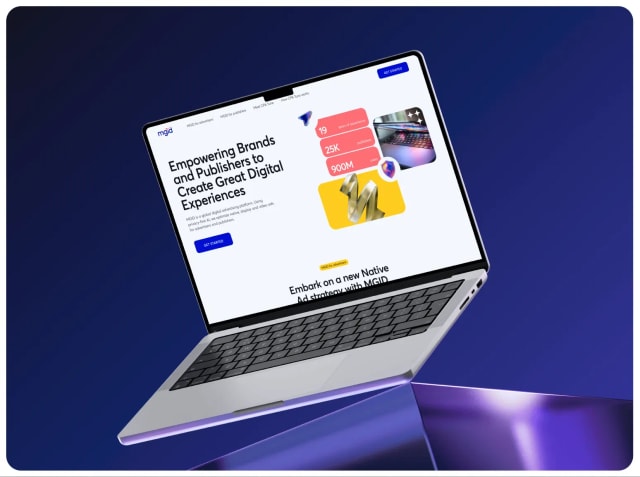
How we continuously design and build MGID landing pages for different products and markets — on one visual system with a library of 3D objects.
Read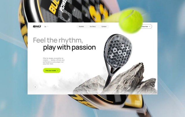
How we modelled six rackets in 3D, tied each to a natural element and built a website with pre-orders — a concept too good to hide.
Read
How we designed the MVP logic, app and web cabinets of Obrii — the Ministry of Economy system built to bring millions of Ukrainians back to work.
Read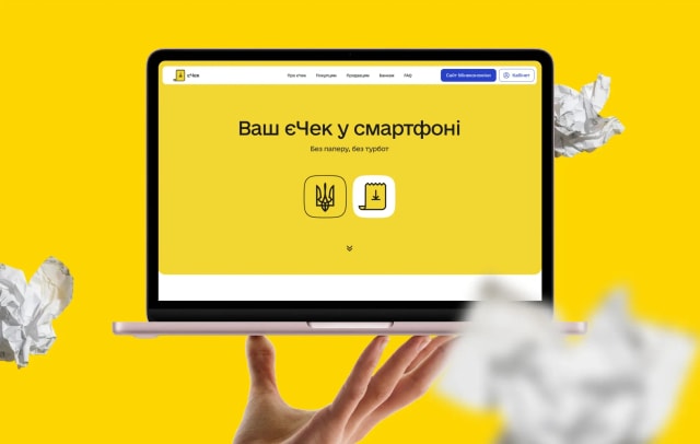
How we built the website and presentations for yeChek — an electronic receipt in your banking app with the same legal force as a paper one.
Read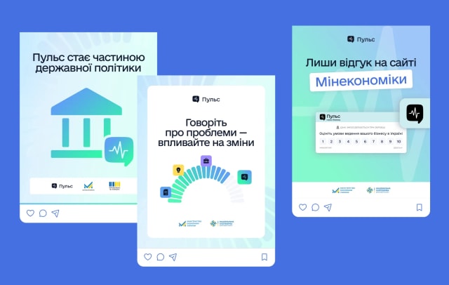
How we redesigned the surveys and built the visual language of Pulse — from 5,000 test ratings to more than 570,000.
Read
How we made the style, website, social posts and presentations for yeDozvil from day one — a permit system where AI handles part of the routine.
Read
Web3 startups move fast.
Read
Tassbeeh is a Telegram mini app that brings Islamic spiritual practice into a digital space.
Read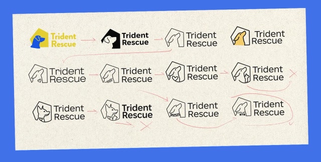
Trident Rescue is a digital platform that helps rescue and rehome Ukrainian animals affected by the war.
Read
Zmist is an online platform with ready, flexible teaching materials for high school.
Read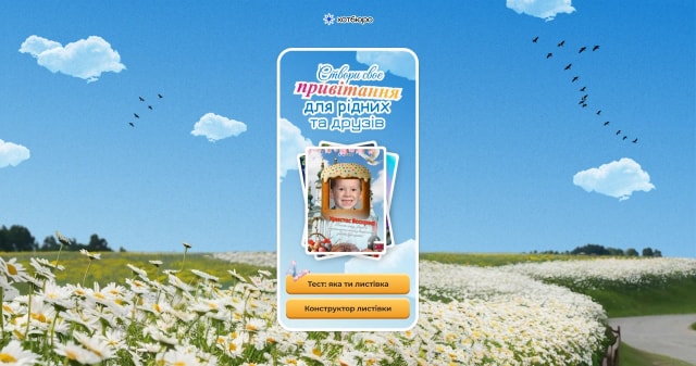
A Hotburo side project: one week of design, one week of development and almost 3,000 Easter cards created.
Read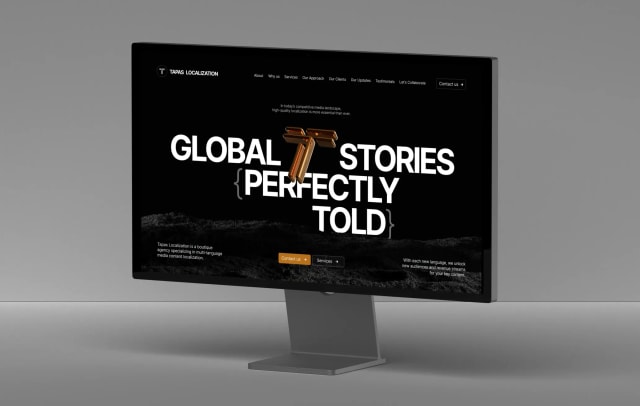
Tapas Localization is a boutique agency that localizes media content across 30+ languages — including rare and even exotic dialects — with real care for cultural adaptation.
Read
How we designed a web platform that gathers testimonies, a registry of perpetrators and evidence of aggression — a foundation for future trials.
Read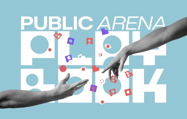
A logo built from human silhouettes, doodles, stickers and a brand book — how we made the identity, website and platform for Public Arena Playbook.
Read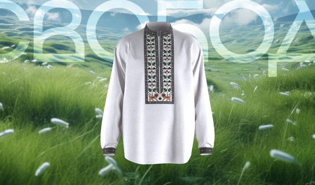
How we combined traditional ornaments and interactive 3D models in the website of a project honouring the defenders of Ukraine’s freedom.
Read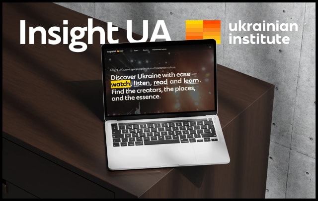
How we created a minimalist website presenting Ukrainian film, music, theatre and art to the world.
Read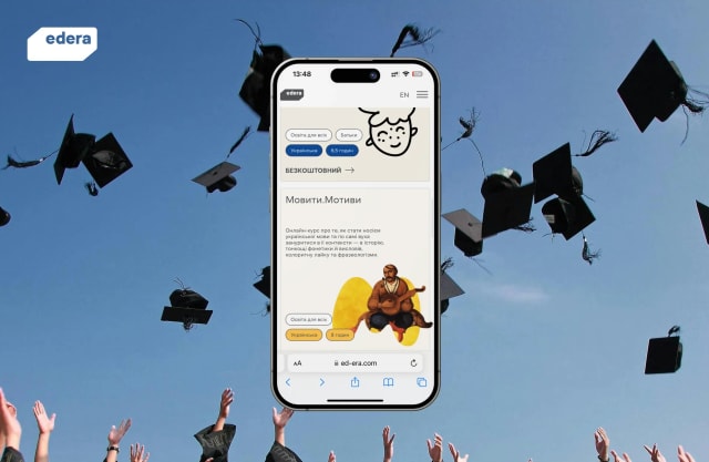
A new palette, tabbed navigation, a personal dashboard with progress and faster loading — how we updated EdEra.
Read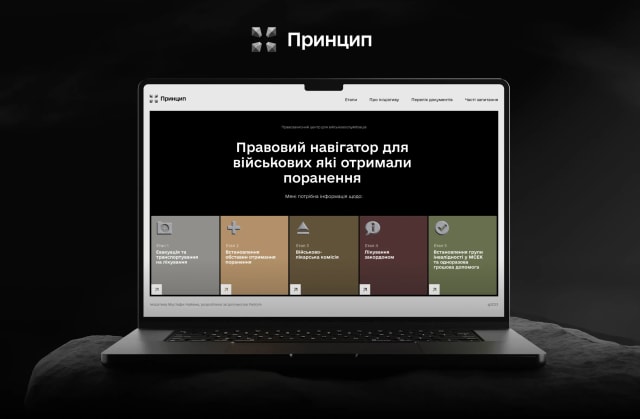
How we worked with Fedoriv Agency to design a service that helps wounded soldiers get legal advice and support.
Read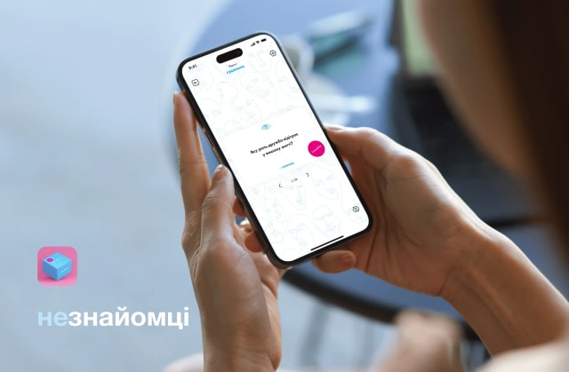
How we took a Ukrainian board game for honest conversations digital — with topics, pause and adjustable game length.
ReadAbout the articles and working with us.
Real studio projects: branding, website and app design, Web3, ed-tech and charity platforms. We show the task, the decisions and the result.
Yes. We write so the decisions transfer: how we build structure, typography, UX logic and design systems.
Use the form at the bottom of the page or write to hello@hotburo.com. We’ll come back with a price and timeline within a day.
After every finished project we can show — usually a few times a quarter.