Raccoonline
logo redesign, landing page, VPN UX and a messenger for a decentralised privacy ecosystem
About project
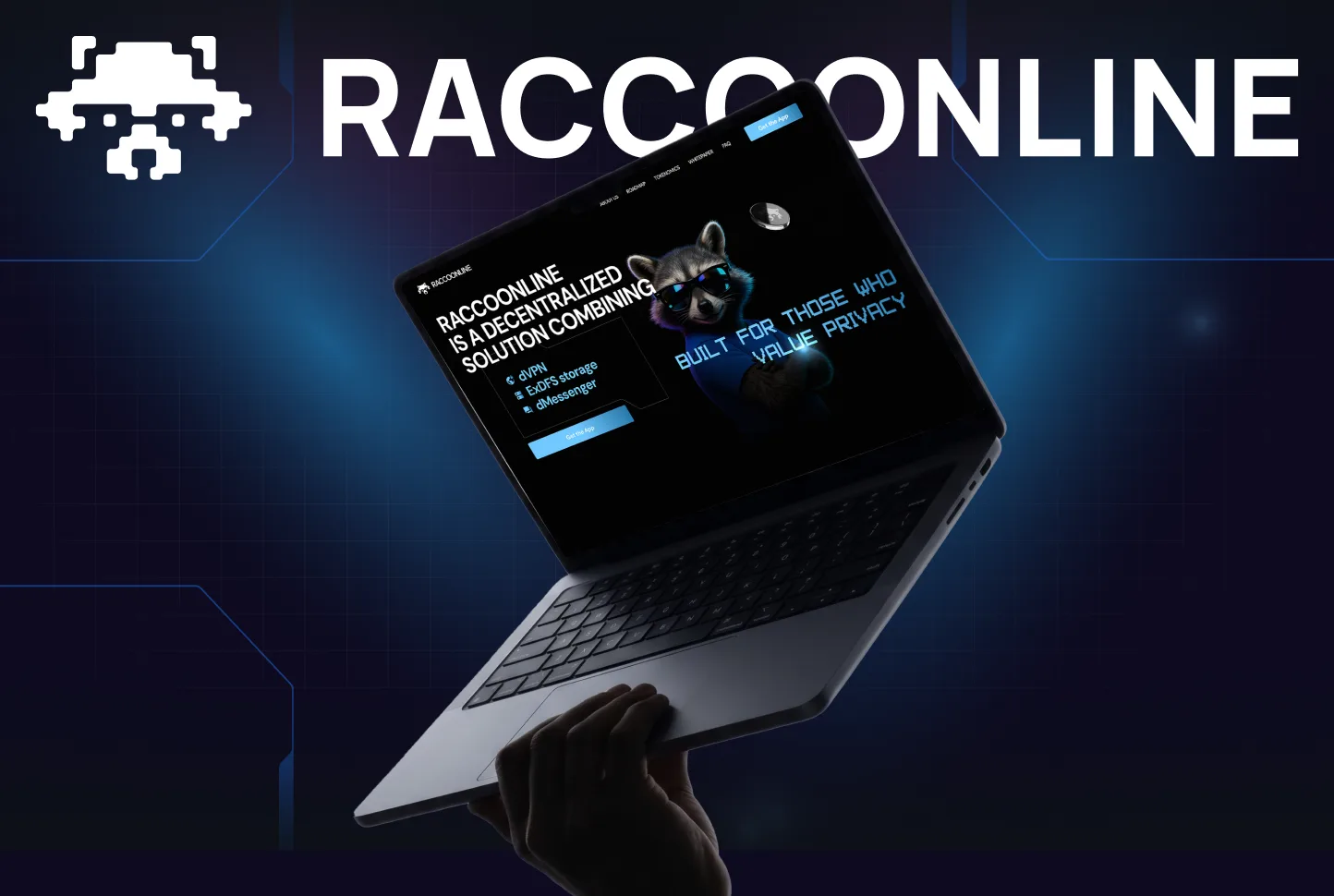
Raccoonline’s raccoon mark was realistic and highly detailed: it worked mostly in white and lost recognisability in other colours and at small sizes. We reworked the logo into a graphic pixel raccoon with a matching wordmark, and the pixel style became the link to the typeface on the new landing page. The landing page is built on black with blue accents, glow and tech graphics, with the raccoon as a character that interacts with the blocks. For the VPN we reviewed the user flows, updated the UI and made a product landing page; the messenger we designed from scratch — structure, core flows, chat states and interactions.
Result
One visual language for the whole ecosystem: the pixel raccoon, typography, dark graphics and tech details now connect the logo, the landing pages, the VPN and the new messenger.