About project
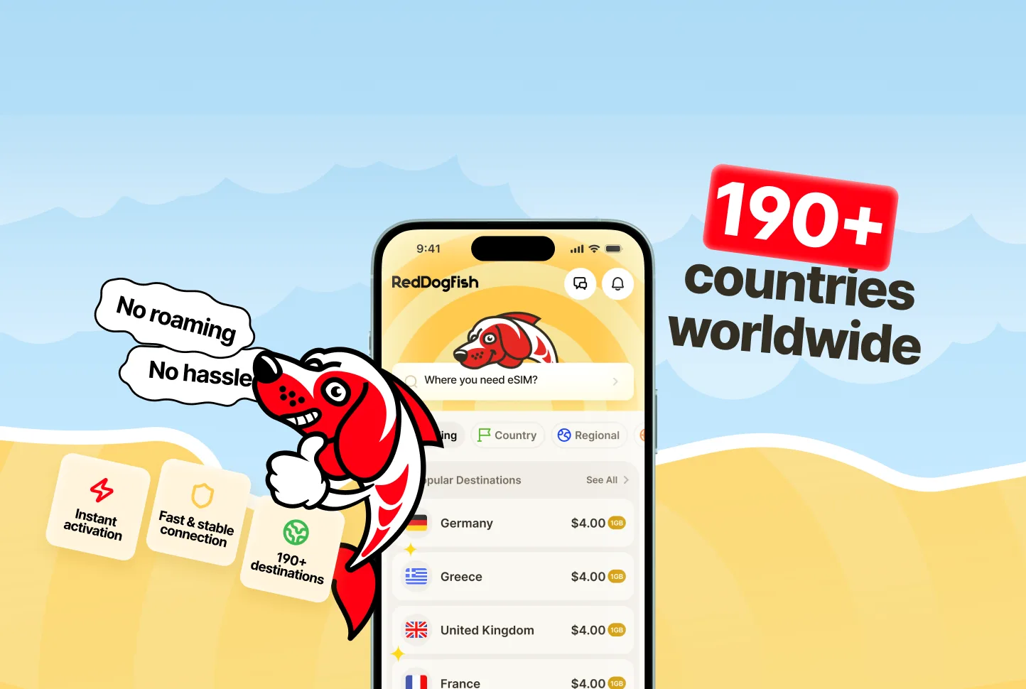
RedDogFish already had a brand, an app and a landing page, so the task was evolution, not a rebrand: keep what people recognise and change only what felt dated or got in the way. We simplified the fish-dog mascot, made it cleaner and drew it in different situations so it supports users across the app. We reviewed the core flows — choosing a country, finding a plan and installing the eSIM — removed unnecessary steps and redrew every screen, rebuilding the brand palette into colour pairs for the interface. The landing page was redesigned in the same new style.
Result
RedDogFish got an updated look without breaking the brand: from the mascot and colours to screens, flows and the landing page, the product and the site now read as one.