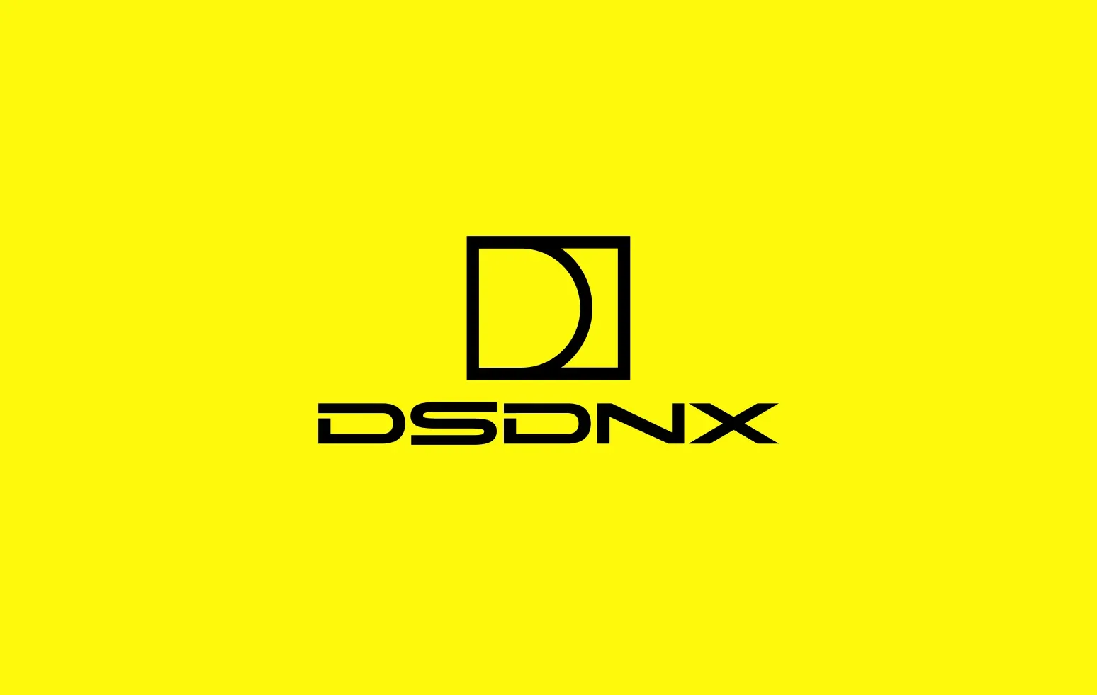
Hotburo case study: logo and identity for DSDNX, a Web3 NFT project — a bridge mark that reads as D, restrained cyberpunk, merch and a landing page.
DSDNX is a Web3 project and NFT collection we worked on in 2022, at the height of the NFT boom. It combined a digital collection, a membership system and exclusive perks for holders. Our task was an identity and landing page that convey its futuristic character and set it apart from other Web3 brands.
- Client: DSDNX, an NFT collection with membership
- Year: 2022
- What we did: logo, identity, merch, digital materials, landing page
- Status: the project was not fully launched
When strong concepts still aren’t right
The client came with logo concepts from another studio — bright cyberpunk and game-dev aesthetics, complex shapes, futuristic details. Strong work, but the client felt something was off and couldn’t say what. The search dragged on for weeks.
With the previous studio’s consent we developed their concepts while proposing our own directions — changing shapes, experimenting with style and composition. None of them felt like “the one”.
An idea from a conversation: the Golden Bridge
On one call a founder told us about his family and its connection to the Golden Bridge in Vietnam. That sparked the thought: what if a bridge became the brand’s symbol? Unusual for Web3, but the more we discussed it, the more meaning we found: a bridge means connection between people, new opportunities, growth and moving forward — exactly what DSDNX and its community stood for.

We reimagined the bridge silhouette as a minimal mark that also reads as the letter D — the first letter of the name. When we presented it among several new concepts, the client reacted instantly: “That’s it!”

Visual system: restrained cyberpunk
The client wanted a bold futuristic style, so we took cyberpunk aesthetics but made them more coherent and restrained: a contrasting black background, acid yellow, technical typography, glow, light glitch effects and blurred neon backgrounds — a digital city of the future. The logo itself stayed simple, so it works as a standalone mark and scales to any medium.


We also designed merch, digital materials and the landing page — one visual system across every brand touchpoint.

What this case taught us
Although the project wasn’t fully launched, it’s one of our favourites — because of the process. The best ideas often come not from references but from conversations with the client. Sometimes one random detail becomes a brand foundation you could never invent artificially.
FAQ
What if no logo option feels right?
Stop searching only for form and talk more with the client about their story and values. For DSDNX the answer came from a conversation.
What does the DSDNX logo mean?
It’s a stylised bridge inspired by the Golden Bridge in Vietnam that also reads as the letter D — a symbol of connection and moving forward.
Looking for a logo with meaning? See how we build brand identities.
Have a similar task?
Tell us what you need — we’ll come back with a price and timeline within a day.