Hotburo case study: RedDogFish eSIM app redesign — a refreshed mascot, simpler plan selection and eSIM setup flows, new screens and a matching landing page.
RedDogFish is an app for travellers that keeps them connected abroad with eSIM. When the client came to us, they already had branding, an app and a landing page. The task was a redesign: refresh the product’s look, simplify the user flows and make every part feel like one whole.
- Client: RedDogFish, an eSIM service for travel
- What we did: mascot refresh, app UX redesign, new screens, landing page redesign
- Approach: brand evolution instead of a rebrand
The task: refresh, don’t rebuild
The brand was already recognisable, so there was no point in breaking it. We looked for what got in users’ way and what felt dated — and changed only that.
A refreshed mascot — the fish-dog
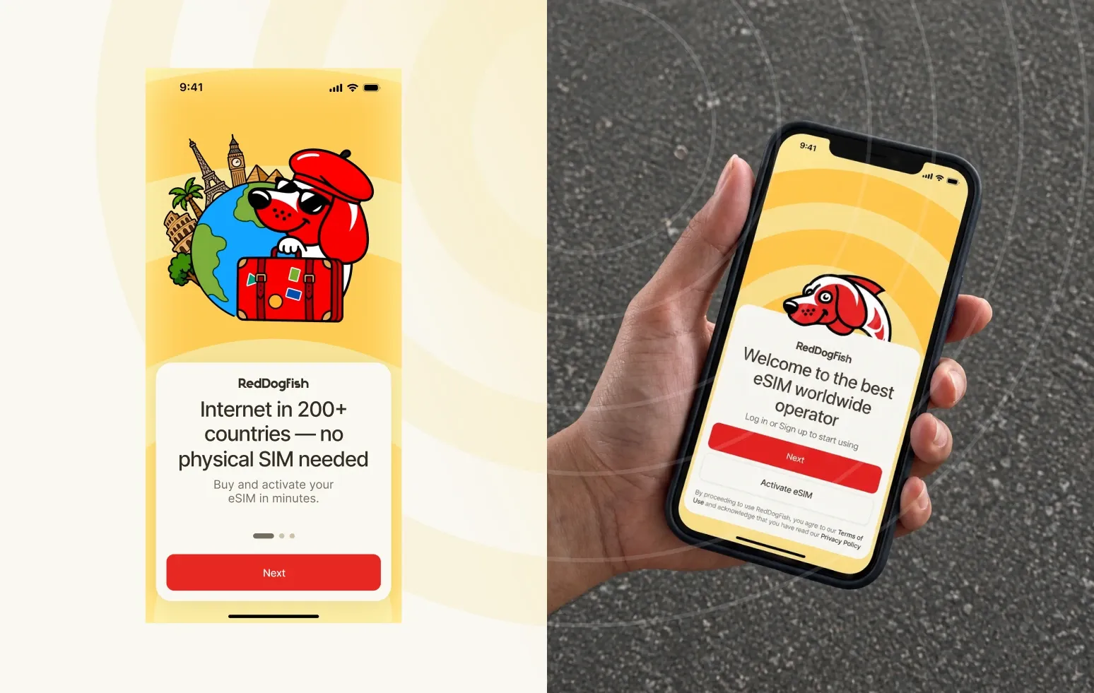
RedDogFish already had a character, a fish-dog. We removed unnecessary details, simplified the shapes and made the illustration cleaner and more modern, while keeping its personality and recognisability.
We also drew the mascot in different situations for specific in-app scenarios, so it now appears across the product and supports the user along the way.

UX redesign: eSIM in a few steps
For an eSIM service, what matters most is that people instantly understand what to do: pick a country, find a plan and install the eSIM without extra steps. We reviewed the core flows, removed unnecessary steps, reworked the key journeys and redrew every screen.

Visually we built on the existing brand book. We kept the core palette but rebuilt it for the interface — colour pairs, backgrounds and their combinations — so the UI became lighter and cleaner while staying recognisable.

A landing page in the new product style
We also redesigned the landing page to carry the new style into external communication, using the updated mascot, colour system and graphics from the app. Now the site and the product read as parts of one brand.

The result
RedDogFish got an updated look without radical brand changes — from the mascot and colours to screens, flows and the landing page. What was recognisable stayed; what felt dated went.
FAQ
How is a redesign different from a rebrand?
A redesign updates how a product looks and works while keeping the brand recognisable. A rebrand changes the foundation — name, mark, positioning. RedDogFish needed a redesign.
What matters most in eSIM app UX?
Speed: choosing a country, finding a plan and installing the eSIM in as few steps as possible, with no technical confusion.
Planning an app or website redesign? See how we approach product design.
Have a similar task?
Tell us what you need — we’ll come back with a price and timeline within a day.