Hotburo case study: Raccoonline logo redesign, a dark tech landing page, VPN app UX and a messenger designed from scratch for a privacy ecosystem.
Raccoonline is a decentralised ecosystem with a VPN, file storage and a messenger, where privacy is one of the core ideas. We started with the logo and landing page and gradually moved on to other products.
- Client: Raccoonline, a decentralised privacy ecosystem
- What we did: logo redesign, landing page, VPN app UX and landing page, messenger designed from scratch
- Industry: Web3, privacy, security

The problem with the old logo
The raccoon mark was realistic and highly detailed. It worked mostly in white and lost recognisability in other colours. For a digital product that’s critical: a mark must read on any background, in any colour and at small sizes.
A pixel raccoon
We fully reworked the logo — both the mark and the wordmark. The raccoon became graphic and pixelated, with a simpler shape and no excess detail. The wordmark was updated too, keeping a similar character.
The pixel style became a key detail: it matched the pixel typeface on the landing page, so the mark and typography started working together.

Landing page: dark tech aesthetics
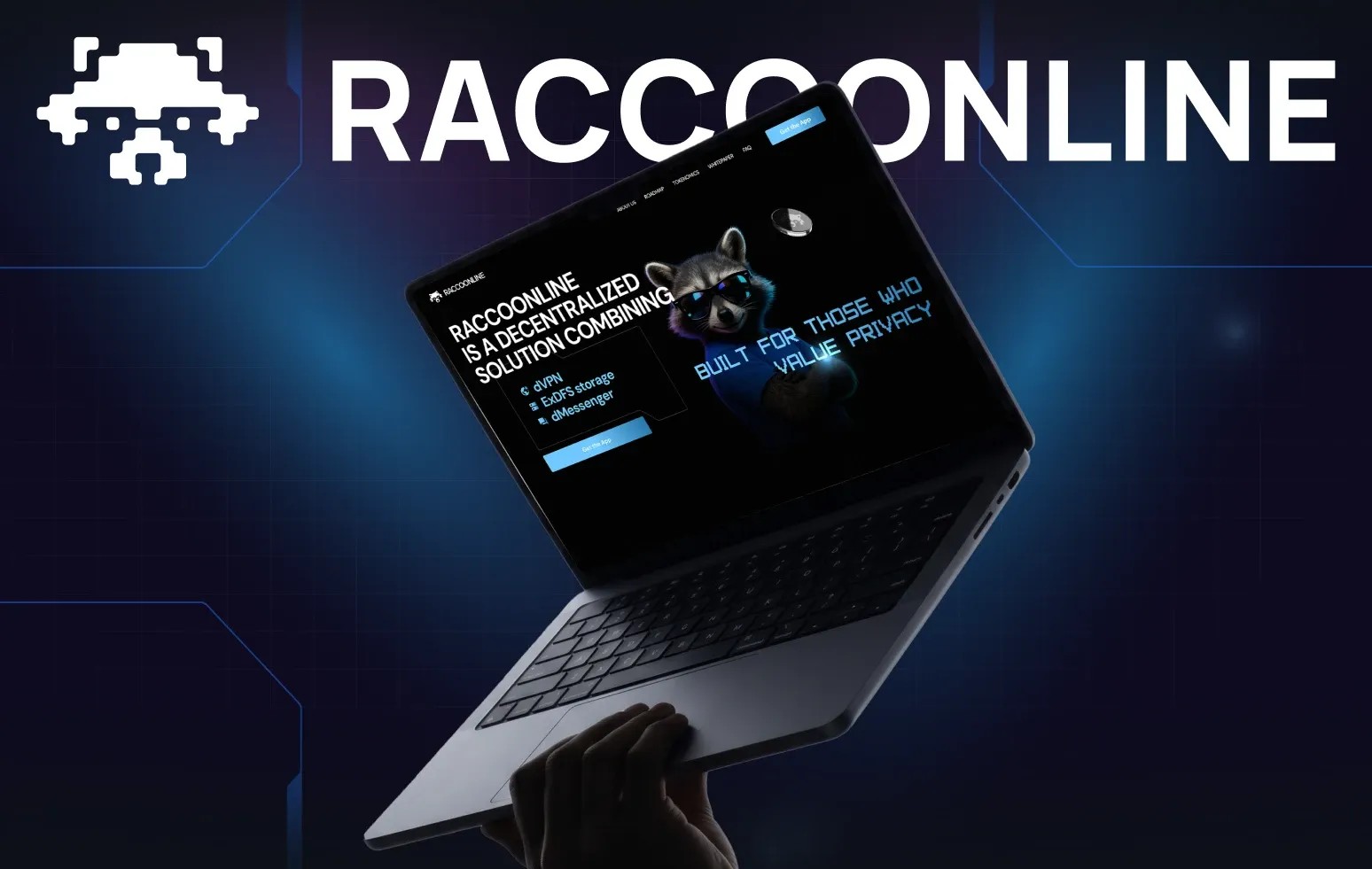
The landing page is built on black with blue accents, glow, geometric shapes and tech graphics. A grotesque keeps it readable; the pixel font adds character and echoes the mark.
The raccoon became a full character: the Raccoonline team updated its look and we developed it in the design — it appears across blocks and interacts with the graphics. Privacy, decentralisation and a distributed network are built into the composition, light effects and animation.

VPN app and messenger
For the VPN we reviewed user flows, updated parts of the UI and UX and made a landing page that explains the product. The messenger we designed from scratch: structure, core flows, chat states and interactions — in the visual language established on the landing page.

The result
We worked across Raccoonline — from the logo and landing page to the VPN and a new messenger. The pixel raccoon, typography, dark graphics and tech details became the shared foundation for the whole ecosystem.
FAQ
Why do realistic logos struggle in digital?
Fine details get lost at small sizes and on coloured backgrounds. Raccoonline’s simplified pixel mark reads everywhere.
How do you keep one style across several products?
Shared elements — mark, typefaces, palette and graphics — adapt to each product’s tasks, from the landing page to the messenger.
Need to rebrand a digital product? See how we approach brand identity.
Have a similar task?
Tell us what you need — we’ll come back with a price and timeline within a day.