Hotburo case study: Glossary Eco Foundation website — branding in digital, a simpler design after user testing and a clear structure.
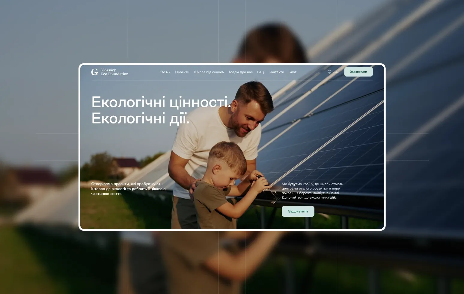
Glossary Eco Foundation works to restore Ukraine’s environmental potential: environmental education, reforestation, clean-ups and other sustainability initiatives. The foundation’s branding was created by Dmytro Krunevych; our task was to bring it into digital and build a website that tells about the foundation’s work and makes information easy to find.
- Client: Glossary Eco Foundation, an environmental foundation
- What we did: website design based on the existing branding, structure, animation
- Branding: Dmytro Krunevych
The first version: maximum brand
For several months we worked on a version that pushed the branding as far as possible in digital: custom graphics, crafted animations and unusual transitions between blocks. The site was meant to be an experience of the brand in itself.
What testing showed
It worked visually, but testing showed the site was too complex for real users. So we changed the approach and started removing rather than adding — larger text, cleaner compositions, simpler and less intrusive animation. Attention returned to what matters: the information and the foundation itself.
We kept the brand’s character: contrast, clean graphics, brand colours and signature blocks. They keep the site recognisable and convey reliability.

Structure: everything essential one click away
Each area — projects, news, about, team, mission and documents — got its own page, so nothing hides in complex navigation. Users get to the right section fast.
The result
A website where the brand works together with the content instead of taking all the attention. Custom graphics and animation stayed, but became more restrained, and the structure clearer. For us it’s a reminder that digital design doesn’t need complexity to be interesting — sometimes months of work are needed to understand what to remove.
FAQ
Why test a foundation’s website before launch?
To check that people find what they need. Here testing showed the design was getting in the way of information, and we fixed it in time.
How do you bring branding into digital without overload?
Keep the key elements — colours, contrast, graphics — and restrain animation so it supports the content rather than competing with it.
Building a website for a foundation or NGO? See how we design websites.
Have a similar task?
Tell us what you need — we’ll come back with a price and timeline within a day.