How Hotburo redesigned the Tapas Localization website around sand, metallic 3D forms and curly-brace typography — a concept built to stand out from competitors.
Their old site leaned on the most predictable image in the industry: a planet. It looked dated and said nothing about what makes them different. They came to us to fix that.
The idea
We dropped the planet and built the redesign on two metaphors: sand and metallic 3D forms.
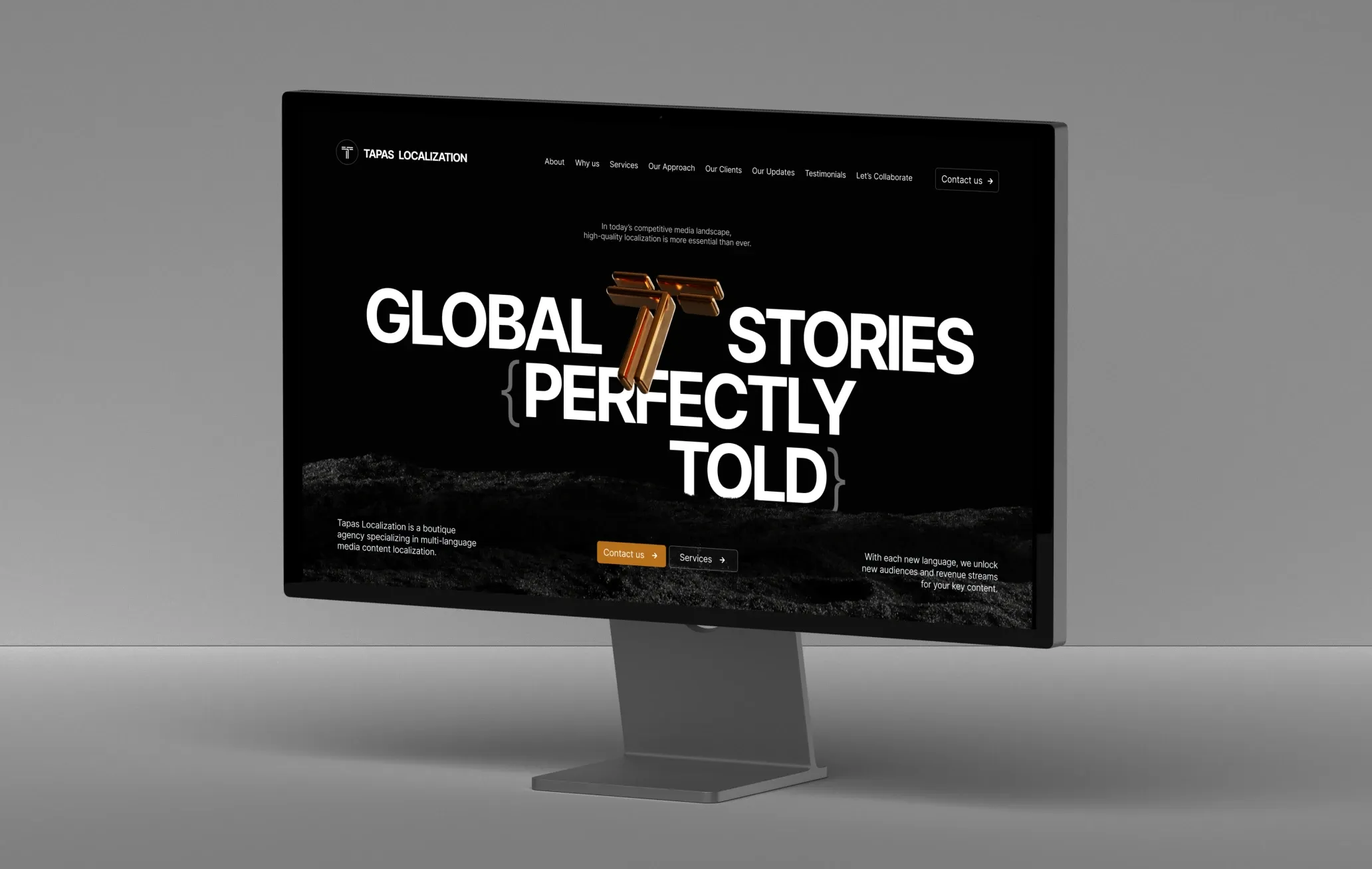
Sand stands for diversity and flexibility — it takes any shape, which is exactly what localization does with content. The metallic 3D forms carry the other half of the story: precision and technology, because localization isn't only creative work, it's a structured process. On the first screen we placed an interactive piece — the letter "T" from their logo, rotating — so the modern, technical feel lands in the first second.
Typography as the concept
Typography carried the design, and we gave it a signature: curly braces { }.
They're not just decoration. In localization, braces mark variables in text — "Hello, {name}!" — the placeholders that let one string adapt to any language or context. We wrapped some headings and key phrases in braces, so the visual language points straight at what the company actually does: flexible, structured, technical.
Colour
The old site was mostly white and fell flat. We made rich black the base for depth and contrast, then took the yellow from their socials and shifted it to a more modern mustard, building warm gradients on top. The result reads premium and helps them stand apart from competitors.
Details that do the work
For the services block we drew a minimalist illustration for each of the eight core offerings — turning a dense list into something clear and easy to scan. We also added a testimonials slider: for a brand built on multilingual work, reviews from different regions are proof of global reach, so we gave them room.
The result
The redesign let Tapas Localization stand out through a concept no competitor shares and typography that carries meaning. The new site reads as more professional, improved how the brand is perceived, and made the whole thing more intuitive to move through. The style also flexes easily into social media and other channels, so the brand stays recognisable everywhere.
See it live: tapaslocalization.com
Need a website that actually says what you do?
We design concept-driven websites and redesigns for companies that want to stop blending in — with an idea at the centre, not a stock visual. If your site isn't pulling its weight, let's talk.
Have a similar task?
Tell us what you need — we’ll come back with a price and timeline within a day.